Real estate logo: rules, files and where it must appear
A real estate logo that works at 20 pixels: the REALTOR® and broker-name rules, trademark basics, the files to keep and every place the logo goes.
A real estate logo has a harder job than most: it has to read at the size of a fingernail on a phone, sit beside the names your licence and your brokerage require, and come in the right file for every place you put it. This guide gives you three tests for small sizes, the US rules on what goes next to your logo, the files to ask your designer for, and a table of every place your logo appears and how small it gets there.
What makes a real estate logo work
Most of the time, nobody sees your logo on a billboard. They see it in a profile circle, the corner of a photo, the middle of a QR code or the tab of a browser. A real estate logo works when it survives those places. Three tests show it before you pay for print:
- The small test. Shrink the logo to the size of a QR code's centre or a profile picture on your phone, then squint. If you cannot read it, nobody else will.
- The one-colour test. Print it in black only, then in white on a dark background. A logo that depends on a gradient or a shadow falls apart on a sign rider or a cheap one-colour print.
- The square test. Does one part of it, your initials or a symbol, stand on its own in a square or a circle?
The square test matters more than it looks. Most of the places that show a logo small are square or round: the favicon, the profile picture, the QR centre, the disc on the floor of a 360 tour. Google asks for a square favicon and recommends one larger than 48 x 48 pixels. A common pattern that passes all three tests is a wordmark with your surname for wide spaces, and a two-letter monogram for small ones.
Four common types, and the test each one tends to fail
- A wordmark (your surname or the agency's name in one typeface) reads well on a sign and fails the small test unless you pair it with a monogram.
- A monogram (two initials) passes the square test, and needs your full name next to it in ads.
- A symbol with a name (a roof, a door, a key) passes the small test, but these shapes are common in real estate: search the trademark register before you commit.
- An emblem or crest (name, symbol and frame in one badge) looks good in print and usually fails both the small and the one-colour test.
Mind the text you set beside the logo, too. The accessibility guidelines exempt logotypes from contrast rules, but the phone number and broker's name next to it are text, and a contrast of at least 4.5 to 1 is what keeps them readable.
The rules: REALTOR®, your broker's name, your franchise
These are US rules, as of November 2026. Outside the US, your regulator sets its own rules on what goes next to an agent's logo: check them before you print.
The REALTOR® marks
Only members of NAR can call themselves a REALTOR®. The term may sit next to a firm's name, but it may not be part of the name, and it must always be separated from it by punctuation, even when it appears on a separate line. NAR's Membership Marks Manual (December 2021 edition) also bars descriptive words next to the marks: "Top Chicago REALTOR®" is one of its own examples of what not to do.
The REALTOR® logo, the block R, has its own rules. NAR says you can reproduce it in any colour, recommends REALTOR® Blue (PMS 293), and asks for a sharply contrasting single colour if you use another one. On a dark background you reverse every part of it, and you keep clear space equal to half the width of the block R on all sides. Keep it out of your own logo too: the same manual says the REALTOR® logo "must not be altered and may not be incorporated into other designs".
Your broker's name
State rules decide what must sit next to your logo, and Texas is a clear example. Under TREC's advertising rules, the broker's name must be at least half the size of the largest contact information in the ad. A logo that contains the broker's full name counts only if the broker's name itself, not the whole logo, meets that size. Signs with an agent's or a team's name need the broker's name too.
Before you print a sign or a business card, check your own state's real estate commission.
Franchise and brokerage brand guides
Franchises publish brand standards, and they often limit personal logos. One example: The REMAX Collection's brand guide supplement says its property signs "may not include personal logos, except for team logos" that meet its rules, and strongly encourages teams to put their logo on a sign rider. That document covers that programme only; your franchise has its own.
Ask your broker for the brand guide before you pay a designer.
Should you trademark your real estate logo?
In the US, the USPTO says you can use TM for goods or SM for services without filing anything. The ® symbol comes only after the USPTO registers your mark, and only for the goods or services listed in the registration. Registration is not required, but a registered mark has broader rights and protection.
Federal filing has a cost. Since 18 January 2025 the base application fee is $350 per class, with surcharges when the information is incomplete or the description is written as free text. States run their own registers as well, so check yours.
Before you pay a designer, search the USPTO database for similar names in real estate services. A trademark attorney can tell you whether your name is distinctive enough to register.
The files to ask your designer for
A logo is a set of files, not one image. Ask for all of these, and get the source files and the rights to them in writing.
| File | Why you need it |
|---|---|
| Master vector (SVG, plus PDF or EPS for printers) | Signs and print scale to any size without blur |
| Full-colour, one-colour and reversed (white) versions | Light and dark backgrounds, single-colour printing |
| Horizontal and stacked layouts | Wide headers versus square spaces |
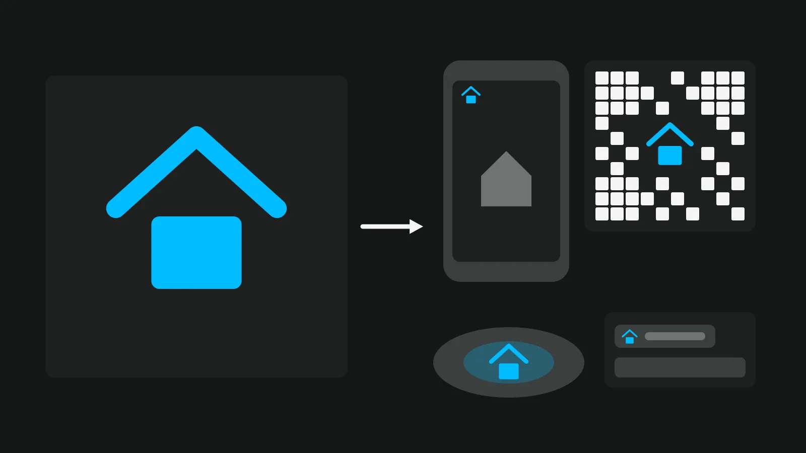
| Square mark (monogram or symbol alone) | Favicon, profile picture, QR centre, the disc on a 360 floor |
| Transparent PNG, large | Apps and tools that take an image upload |
| The colour codes (HEX, RGB, and CMYK or Pantone for print) and the font names | So every place matches |
Write the colour codes and font names in one short document, your brand guide, and send it to anyone who makes something for you.
Where your logo has to appear, and how big it really is
This is where a logo fails or works. The table shows each place, its shape and the version to use.
| Place | Shape | How small it gets | What to use |
|---|---|---|---|
| Website favicon | Square | Google recommends larger than 48 x 48 px | Square mark |
| Google Business Profile | Square image | JPG or PNG, 10 KB to 5 MB; Google recommends 720 x 720 px, minimum 250 x 250 | Square mark with a margin |
| Social profile pictures | A small circle on most apps | Check the app's help for the current size | Square mark with a margin |
| Social images and reels | A corner of the image | Small, in a 1080 x 1350, 1080 x 1080, 1080 x 1920 or 1200 x 630 image | Horizontal logo |
| A 360 tour | A corner of the viewer, and a round disc on the floor where the tripod stood | About 20 px tall in the corner of a Vistura tour | Horizontal logo in the corner, square mark on the disc |
| A QR code centre | A square in the middle | About a fifth of the code's side in Vistura's codes: on a 3 cm code, about 6 mm wide | Square mark; the code needs high error correction |
| Listing photos | A corner | Small | Transparent PNG; put your logo on many listing photos at once, and check what portals allow in listing photos |
| Signs, riders and business cards | Varies | Large, but next to the broker's name | Vector; the rules above apply, and here is how to print a QR code that scans |
| Email signature, reports to sellers | A strip at the top or bottom | Small | Horizontal PNG |
For the QR code and the tripod, there are free tools: a free QR code with your logo and a way to cover the tripod with your logo.
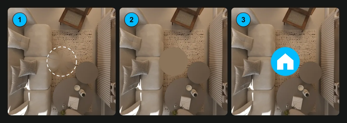
In Vistura, on Pro, one upload of your logo reaches everything that comes out of your tours. Your tours carry your logo and colours with no Vistura badge, with the logo in a corner of the viewer. In the tour editor, under "Hide the tripod", choose "Logo": a disc with your logo in a colour taken from the floor, and "Apply to all photos" does it for the whole tour. Choose "Your logo" as the "Centre of the QR code", and it appears in every QR code of your tours. The social media images in four sizes, the vertical reel that ends on your brand and a QR code, and the owner report you send the seller all carry your logo. Every new account starts with 14 days of Pro, with no card, so you see your brand on a real tour before you choose a plan. See the plans.
Your logo is one part of your real estate branding
A logo is your signature. Your real estate branding is what people remember after they meet you: how fast you answer, how your photos look, how your tours feel, what your bio promises. Real estate agent branding works through consistency, the same colours and the same mark in every place, so a seller who saw your sign recognises your post a week later. For personal branding, the logo is the smallest part; the habits behind it are the rest.
Plan where the brand shows up with a 30-day marketing plan for each listing, and fill your feeds with these real estate social media post ideas.
For agencies, Vistura Business keeps one brand on every agent's tours: the agency's logo and colour on every tour, with no Vistura badge. Tours can also open on the agency's own address, for example tours.youragency.com.
Checklist before you print
- The logo reads at the size of a QR centre and a profile circle.
- It works in one colour, and reversed in white on dark.
- A square mark stands on its own.
- Your broker's name is on every ad, at the size your state requires.
- REALTOR® sits outside your name and logo, only if you are a member.
- Your franchise or brokerage brand guide allows it.
- TM or SM until registered; ® only after.
- You have the vector master, the versions, the PNG and the rights in writing.
- Colour codes and fonts are written down in a brand guide.
- The logo is uploaded everywhere it appears.
In Vistura, open Settings > Brand & domain, choose "Upload logo" and upload the large transparent PNG once. On Pro, "Background behind the logo" is on by default so the logo stays readable on any photo; turn it off if your logo already has enough contrast.
Frequently asked questions
Can I put REALTOR in my logo or business name?
Not in the name. NAR says the term may sit next to a firm's name, separated by punctuation, but may not be part of it, and only NAR members may call themselves REALTORS®.
Do I need my broker's name next to my personal logo?
In Texas, yes. In Texas the broker's name must be at least half the size of the largest contact information in the ad, and a logo only counts if the broker's name in it meets that size. Check your own state's commission.
Can I use the ® symbol next to my real estate logo?
Only once the USPTO has registered your mark, and only for the services listed in the registration. Before that, you may use TM for goods or SM for services without filing anything.
What file size should a real estate logo be?
There is no single size. Keep a vector master that scales to any size, a large transparent PNG for apps and tools, and a square version for small places. For a Google Business Profile, Google recommends images of 720 by 720 pixels.